StudioThe studioSelf-initiated identityIn use on this site

Ümbe, itself
The studio's own identity: one mark in four states, lettering drawn in code, colour that arrives two at a time, three typefaces and five ways of moving. Every page of this site is made from it.
01The red star
Primary mark16 / 24 / 44 / 88 px
Red on paper
Paper on red
Red on slate
Six petals with a star knocked out of the heart. The petals are taken from the centre of the earlier ÜMBE star, so the mark keeps where it came from without the badge. It sits beside the name in the bar, in the browser tab and at the end of every page, and it holds from 16 pixels to the size of a wall.
02One mark, four states
Mark familyBloom
The ring holding the petals. The biggest print, behind type, showing through its counters.
Flower
No ring. With the star in its heart it is the primary mark; without it, punctuation.
Halo
A ring and a small star. The quiet one: it marks a question before it is opened.
Field
A disc with the flower cut out of it. It leaves by an edge.
03Printed, not placed
Stamps- Flat colour, overprinted: where two marks cross, the inks multiply.
- Every stamp drops out through the same grain, so no two edges print clean.
- Turned, scaled and cropped by the page edge; never outlined, shaded or glowing.
- Stamps may cross from one section into the next. Small text never sits on one; it is knocked out onto its own field.
04Letters drawn in code
Lettering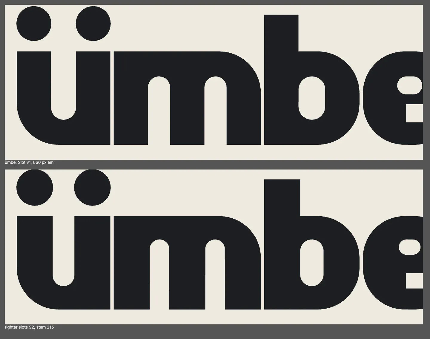
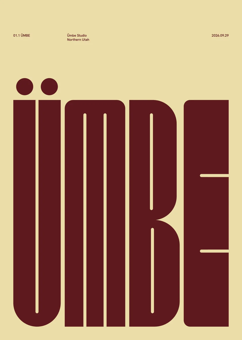
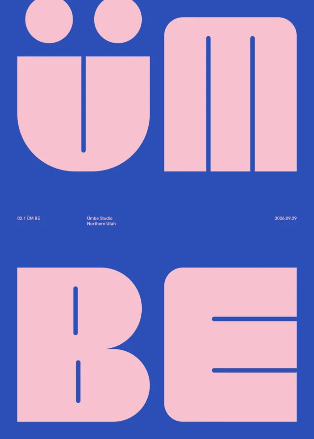
Two letterings, both constructed with Python and shapely rather than set from a font. Ümbe Slot is the lowercase on the poster: every counter is one narrow slot, the m has a flat roof and the umlaut is two full circles, so the word reads as one block of ink. Ümbe Mass is the capitals of the print series: each letter a mass with a hairline slot, filling its sheet to the margin.
05Colour, two at a time
Colour pairs- ÜTaupe / acid#968C76 #EDE84B
- MMoss / lime#1F4A34 #E8E34A
- BNavy / blush#1C2A48 #F2AFC0
- ERasp / petal#B01E48 #F7C9D4
- üButter / wine#EBDDA8 #5E1A1E
- mCobalt / pink#2B4FB8 #F7C0CF
- bRose / chocolate#B58E84 #2A1712
- eViolet / plum#8E64C4 #2E0B1A
Paper, #F0ECE3, and slate, #1C1F22, carry the reading. Colour arrives as print, and after the poster every section is one pair: a full field and a single figure colour for big type and marks. The rule comes from the two-colour prints Kalle Lindeman and Wille Larsson make for Wall of Art. Where a figure colour is under 4.5 to 1 on its field, small text takes the pair's ink instead.
06Three faces, three jobs
TypeInter Tight 900 / names, titles, big wordsIdentity, campaign, digital.
Hanken Grotesk 700 / labels, set in small capitalsSELECTED WORK / 04 / NORTHERN UTAH / LIVE
Switzer / readingOne designer, from the first sketch to launch. The words are set plainly so the work can be loud.
07Fitted or cropped, never in between
CompositionA big word is either fitted to its sheet margin to margin, measured in the page, or so large that the edges crop it. Nothing sits politely in the middle. Each scene has one dominant element, a few supporting ones and a line of small facts, the way a poster does.
08Five ways of moving
MotionAssemble
Parts converge into the mark or the word. The star at the end of the home page; the letters of Make.
Align
A piece slides from off the grid into its column. Plates and the capability words.
Separate
A composition comes apart. The poster as you scroll away from it; the red star at Launch.
Reveal
An image or a word appears through a mask. The Wallcreeper plate; titles rising out of their own baseline.
Transform
A mark turns or changes state. Stamps turning with the scroll; the halo becoming the flower when a question opens.
Nothing loops for decoration. The poster prints itself once, one colour pass at a time, when the page opens. After that every movement is tied to the scroll or a click, on the browser's own scroll timeline with no animation library; films and the Wallcreeper stage play only while they are on screen and have a pause button. All of it stops for anyone whose device asks for reduced motion.
09Three rounds
Process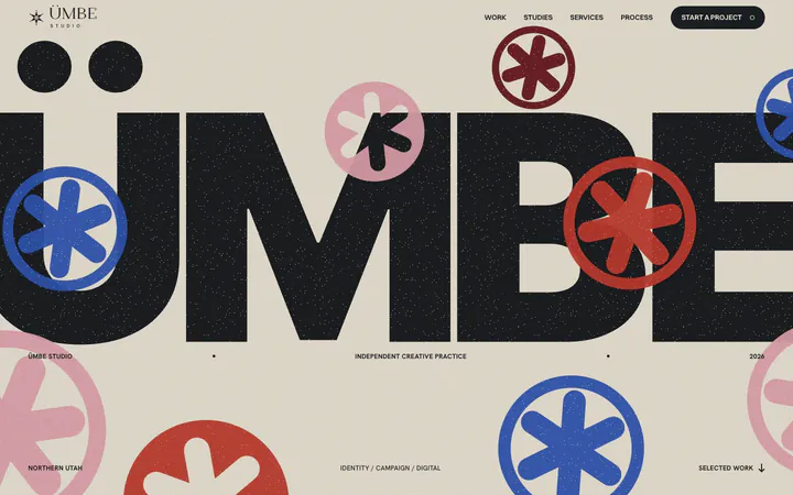
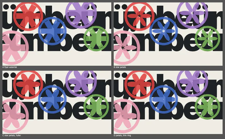
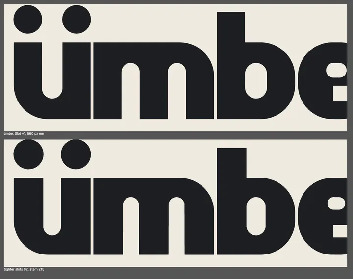
The first poster was a clean ÜMBE with ring stickers spread across it, and it read as a website headline. The second round took the architecture of an event flyer, a date row, a lineup and a venue, and tested the marks over the letters until the star's petals won. The third drew the lowercase until the word held as one block. Each round was judged against printed references, not against other websites.
What you are looking at
Everything in chapters 01 to 08 is drawn live by this page from the same files the rest of the site uses: the marks are one SVG, the pairs and type are the site's own tokens, the motion is the site's own CSS. The poster at the top and the proofs in chapter 09 are captures of the real work at the time it was made.
Credits
- Identity, lettering, website, motion
- Ridge Nelson, ÜMBE Studio
- Influences, named
- The two-colour prints of Kalle Lindeman and Wille Larsson for Wall of Art; the layout of an event flyer
- Type
- Inter Tight, Hanken Grotesk (SIL Open Font License), Switzer
- Code
- Python and shapely for the letters and marks, HTML and CSS for the site; written with AI assistance, directed and checked by Ridge Nelson